I led the experience and design for Keakie's MVP app onto both iOS and Android stores, securing over £5m in investment.
Joining Keakie as the inaugural UX/UI hire, I spearheaded the end-to-end design and experience for its MVP across iOS and Android. Collaborating in a lean Scrum setup with cross-functional stakeholders, we launched successfully in just four months, a testament to rapid alignment, high organisation, and agility.
Given an unestablished user base, we adopted a Lean UX approach, rapidly defining problems, testing with internal audiences like DJs, mixers, and genre curators, and continuously iterating. Resource limitations meant adapting workflows and prioritising deliverables efficiently to move the needle.
Stakeholder interviews helped ground the product in meaningful context rather than pursuing an app for its own sake. Key insights included:
I wanted to get beyond the need to "launch an app", because that's a solution to an unknown problem. It was fundamental for me to understand: why would a user choose us over Spotify or Apple Music? Are we reinventing a wheel that doesn't need to be touched?
^ this question changed everything 💡The app had an initial roadmap shaped by stakeholder input, but we needed a shared starting point to align the entire team. We ran assumption-mapping sessions, capturing best-informed guesses about user needs, product direction, and potential risks.
By openly declaring these assumptions, we created space for collaboration and critical discussion, inviting music industry experts, curators, the CEO, and CTO to challenge ideas, surface unknowns, and collectively define the problems we were solving.
Once the team had aligned on priorities, my role was to turn those into tangible, actionable user stories. Each story was framed with clear acceptance criteria, giving developers clarity while ensuring stakeholders understood exactly what success looked like.
This approach kept the team focused and created a shared language connecting strategy, design, and execution, helping us move faster while staying aligned on what truly mattered for our users.
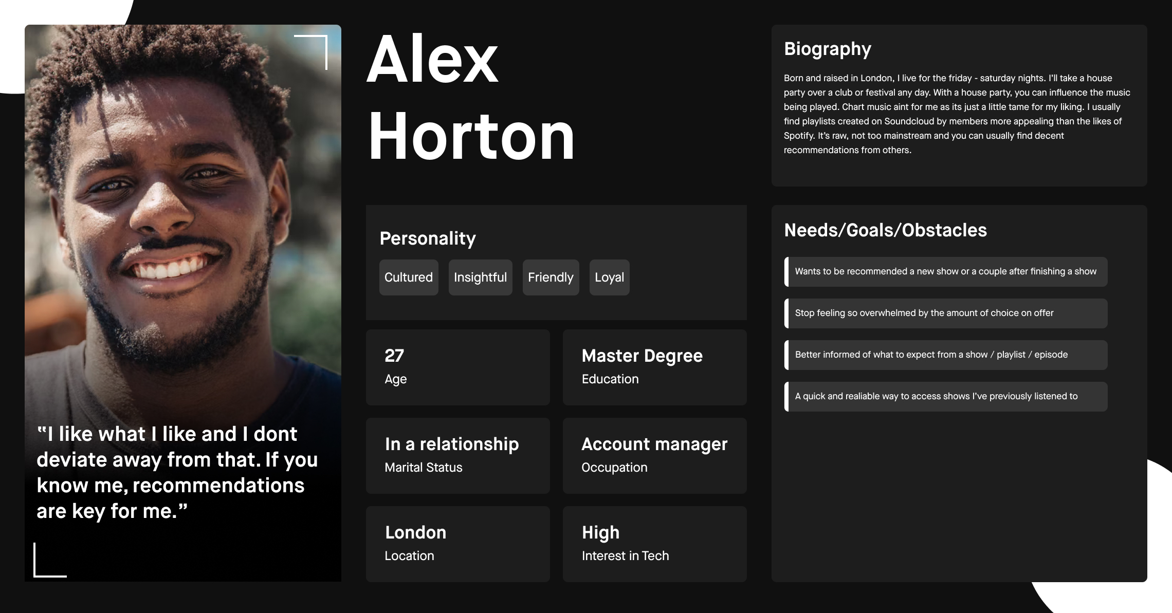
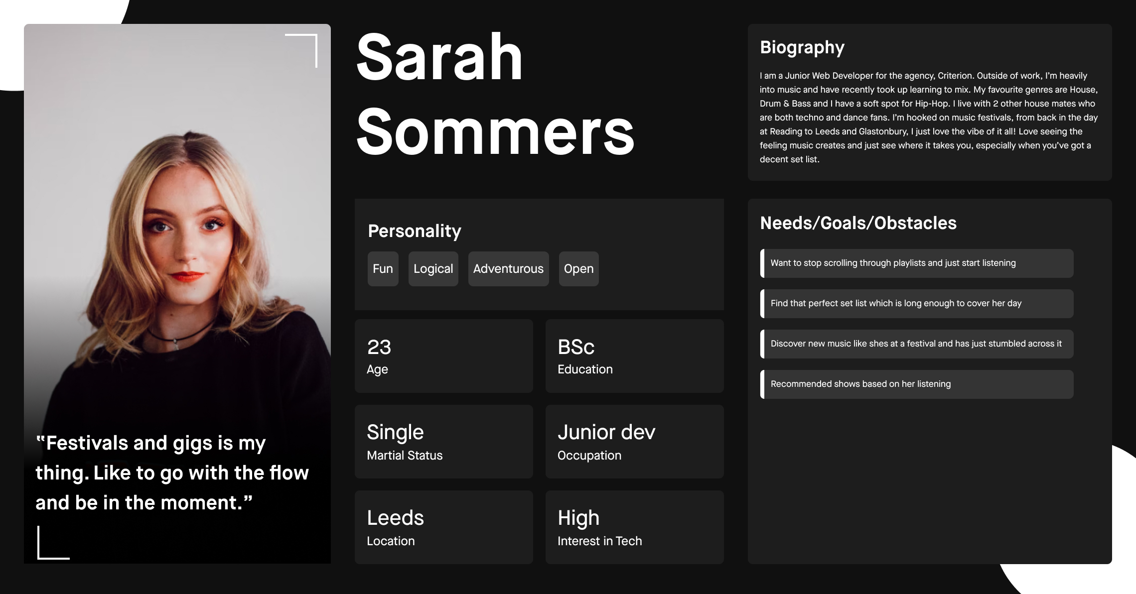
In the absence of formal user research, I introduced proto-personas as a lightweight, flexible way to align the team on who we were designing for. Unlike traditional personas, proto-personas evolve, they allowed us to move quickly while staying open to change.
These became a shared reference point, helping us prioritise MVP features and reminding everyone that we are not the end users.
I collaborated closely with product, engineering, and content teams to define shared design principles. Through workshops, we explored competitive benchmarks and mapped out core moments in the discovery journey.
Recurring themes emerged: the importance of elevating curated content, building trust through context, meeting baseline streaming expectations, and keeping the experience simple. These principles became decision-making anchors throughout the project.
Since Keakie already had an established website, I focused on adapting its existing visual language rather than reinventing it. The goal was to extend the look and feel into the app while keeping effort and complexity low.
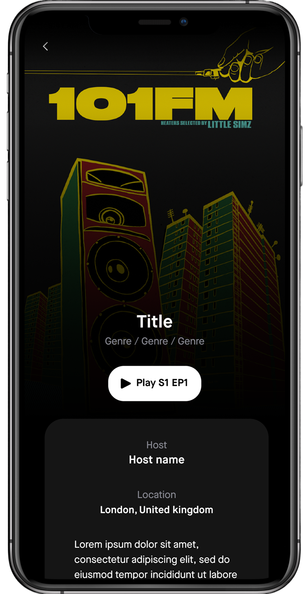
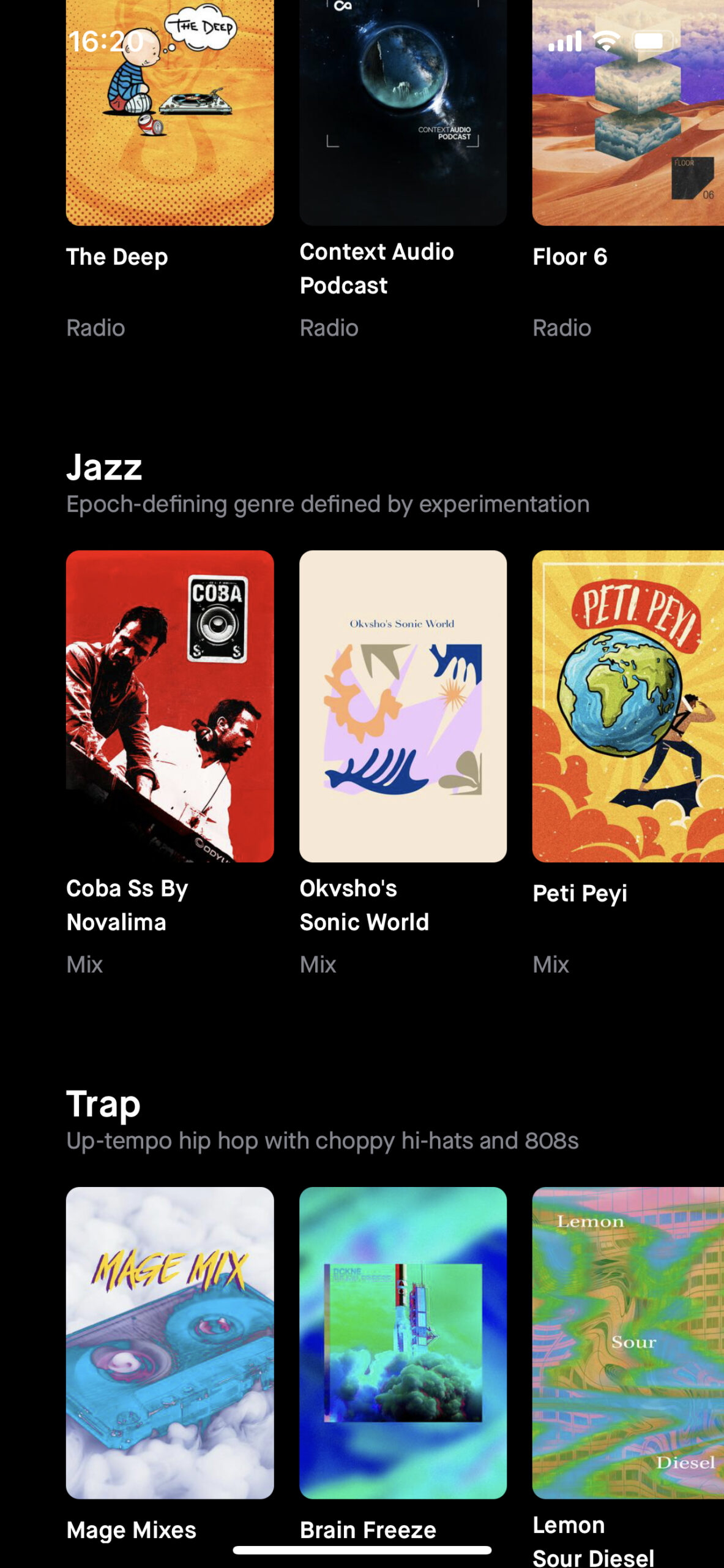
The Shows page was designed to put content discovery at the heart of the experience. Each show blends curated music with unique storytelling, so the goal was to elevate the content while keeping the interface simple and intuitive. We focused on a clear information hierarchy, highlighting show artwork, host info, episode descriptions, and playback controls.
This is the first screen users encounter after logging in, a critical moment. At this early stage, we relied on genres to guide users since individual shows would be unfamiliar to most. Our goal was to surface relevant content quickly while testing the value of displaying key metadata alongside artwork.
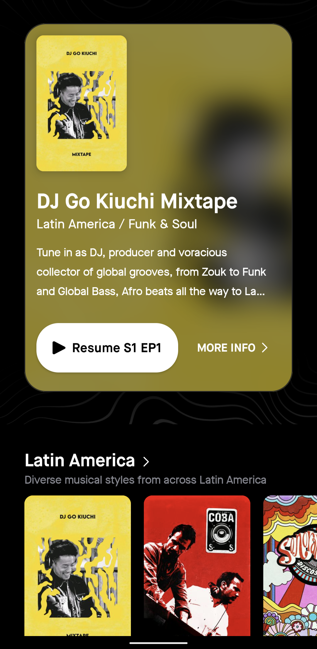
Users are served a recommended show at the top, followed by curated genres paired with short descriptions, especially helpful for less familiar or underground genres. Following Hick's Law, we intentionally limit the number of shows in the initial viewport. Over time, content dynamically adapts based on listening habits.
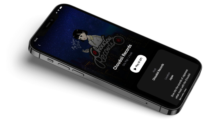
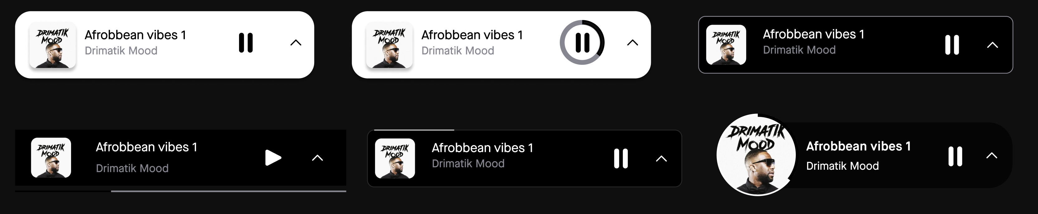
The mini-player came with clear expectations around information display. The real challenge was presenting this in a way that elevates the host and showcases the show without overwhelming browsing. We explored over 20 design variations, iterating rapidly to find the right balance between functionality and personality.
↑ Interactive, tap the mini-players to see them in action
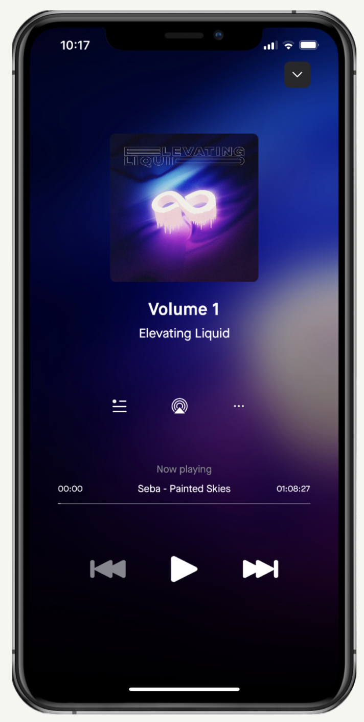
The full-screen player was designed first and directly influenced the final mini-player variant. It showcased the host and content prominently, with show artwork subtly integrated into the background for immersion. The biggest challenge was information hierarchy, we prioritised the episode title as the primary header.

We didn't yet have an established audience, but we had access to a valuable network of industry professionals, hosts, DJs, and music curators directly shaping the platform's content. These individuals became an essential part of our feedback loop.
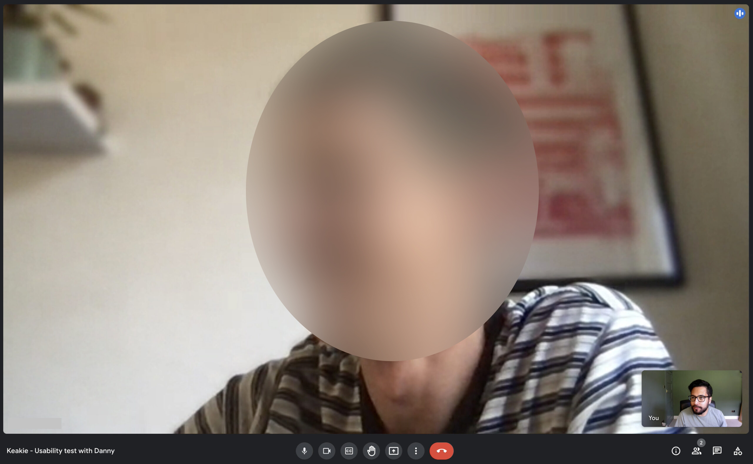
We adopted a lightweight usability testing approach, focusing on rapid feedback. We tested whatever was ready, from low-fidelity wireframes to high-fidelity prototypes, validating ideas quickly and uncovering mismatches between assumptions and reality.
Feedback that wasn't immediately actionable was placed in a "parking lot" to revisit later, helping us spot emerging patterns without slowing delivery.

We successfully delivered the MVP to both app stores, achieving a 4.8 star rating and helping secure over £5m in investment. Close collaboration with leadership, constantly challenging our thinking and recalling the core problem, was what worked best.
By designing together, we were always striving to be user-centric despite limited research resources. At times we got caught in output nuances better suited for design crits, but we kept momentum and shipped.