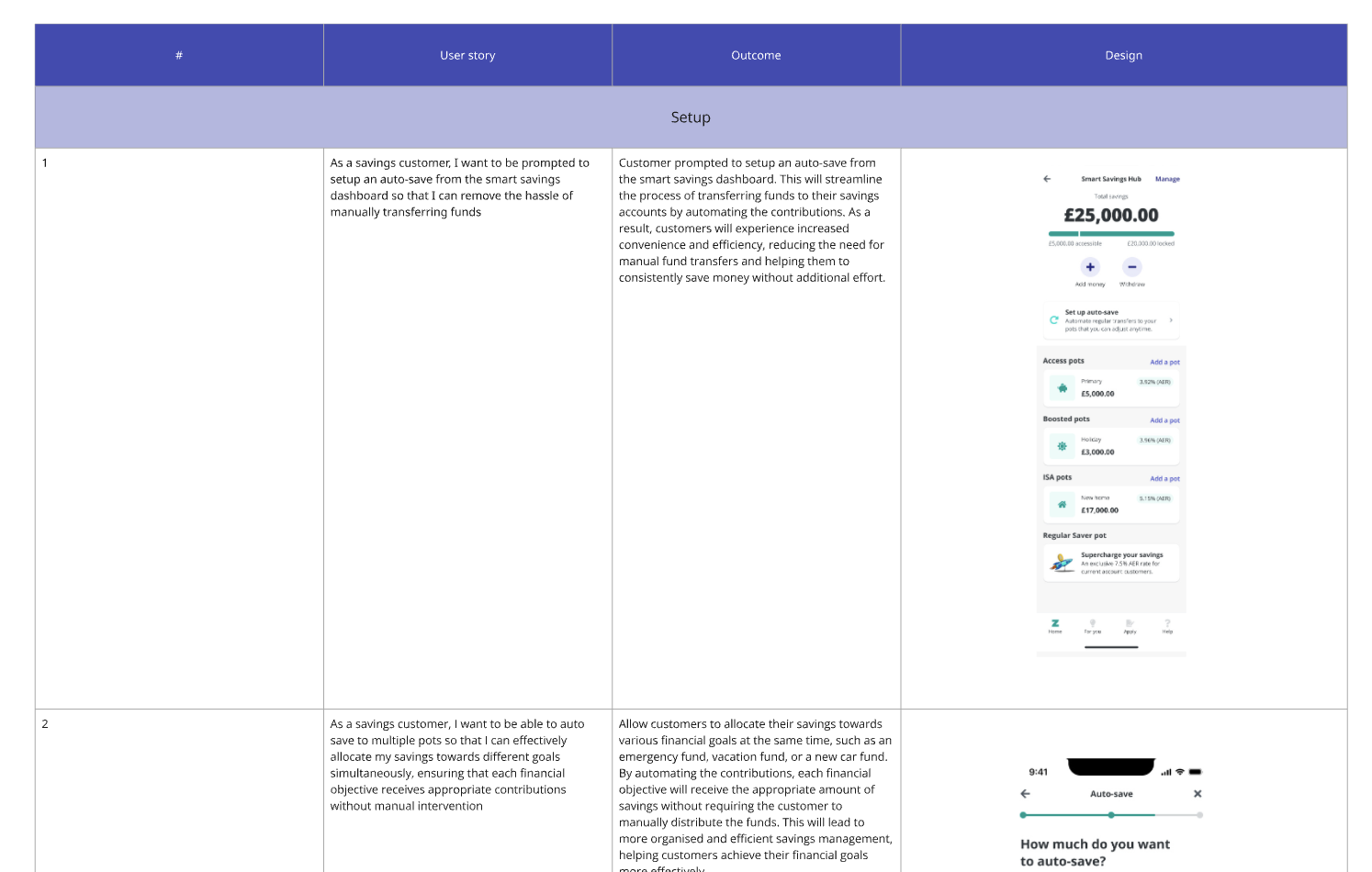
Redefined Zopa's Auto-Save feature to let customers split deposits across multiple savings pots, giving them more control, clarity, and flexibility.
💼 Role: Senior Product Designer
🏢 Company: Zopa
⚡ Year: 2025
🎯
✦ Objective
Smarter savings through open banking
To enhance Zopa's Auto-Save feature by leveraging open banking to give customers greater flexibility and control when funding their savings. The goal was to simplify the process by enabling users to automatically split deposits across multiple savings pots, reducing manual effort while maintaining transparency and choice.
📊
✦ Measuring Success
Defining what good looks like
We set clear, measurable goals focused on adoption, engagement, and customer value:
+30%
Adoption rate uplift
Within first 3 months
75%
Retention target
Continued use beyond setup
+25%
Monthly inflow uplift
Across Smart Saver
🔍
✦ Desk Research
Understanding the landscape
I conducted a comprehensive competitive analysis across both incumbent and challenger banks, understanding how the industry approaches payment flows, identifying best practices, and uncovering opportunities to differentiate.
Plum uses AI to analyse spending habits and automatically transfers an affordable amount to savings "pockets." Monzo's round-ups feature saves spare change from transactions into designated Pots. Starling's Savings Spaces act as virtual piggy banks for different goals within the main account.
Insights workshop
To set the foundations, I ran a collaborative workshop with product, design, and research teams. The goal was to align on what we already knew about customer saving behaviours and identify the knowledge gaps that needed validation.
Our workshop revealed that while customers want to save regularly, their behaviours are inconsistent and fragmented. Many contribute monthly but vary the amounts, and most manually move money between pots after depositing.
^ so much manual effort just to save 💡
🧪
✦ Research
Closing the gaps
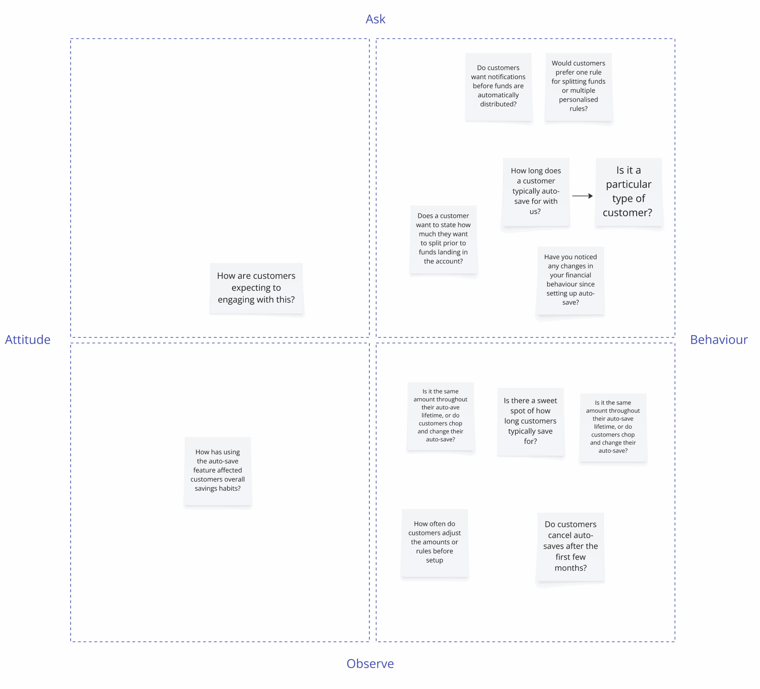
To validate our assumptions and uncover new insights, I proposed and conducted customer interviews. This had immediate buy-in, it was clear we had a number of unknowns we needed to understand before moving into design.
8 interviews with single-pot savers, multi-pot savers, and existing auto-save users
Explored how they decide where to allocate deposits
Tested comfort levels with automation vs. control
Understood expectations around notifications, confirmations, and flexibility
Key takeaways
Trust is critical
Customers value flexibility, but many want transparency and reassurance before letting automation take control of their money.
No single mental model
Some users prioritise pots based on goals, others based on amounts or timelines. There's no one-size-fits-all approach.
Options, not complexity
Users want choice in how they save, but the interface needs to stay simple and not overwhelm with too many decisions.
🎨
✦ Design
From research to solutions
With clearer understanding of customer behaviours, we transitioned to design. We didn't have immediate alignment on the focus, so we arrived at two hypotheses to shape the direction:
Hypothesis 1: Users prefer percentage-based rules over fixed amounts. Hypothesis 2: Users want both a global Auto-Save setting and per-pot overrides.
^ two bets to test against each other ⚡
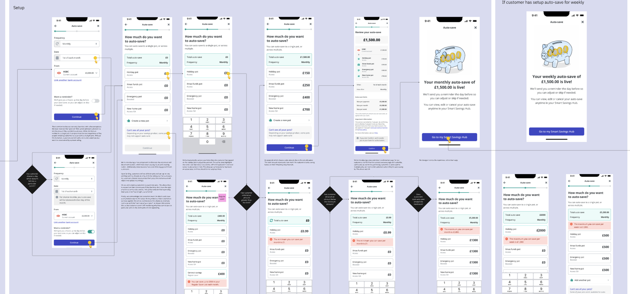
Wireframes
I started by exploring different approaches, experimenting with navigation patterns, allocation inputs (sliders vs. number fields), fund split visualisations, and placement within the journey. These explorations helped surface early insights and shape hypotheses for usability testing.
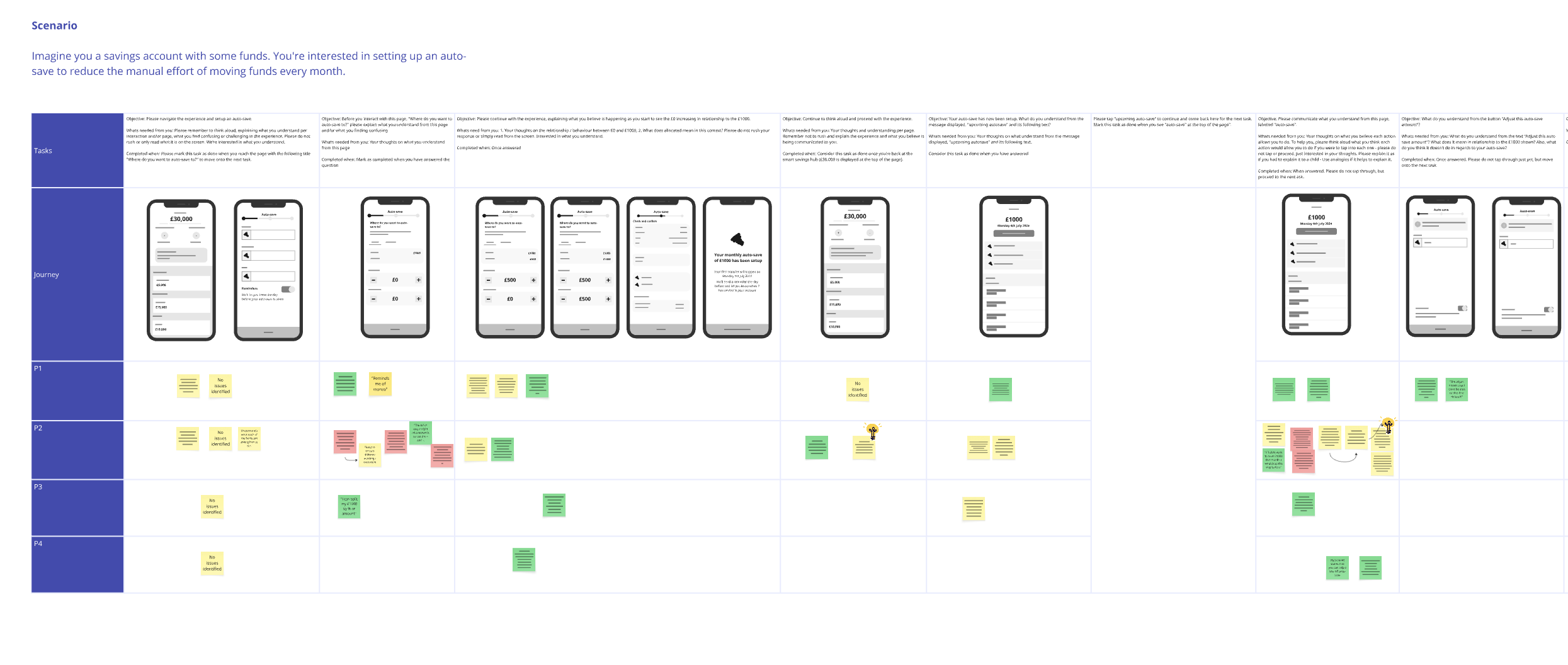
Testing the thinking
We ran remote usability testing with a diverse mix of customers. We explored three different journeys, a simple single-rule setup, a flexible multi-rule version, and a hybrid approach. Tests revealed that customers valued simplicity first, but also wanted optional flexibility through overrides.
Insights from testing
Simplicity wins, flexibility matters
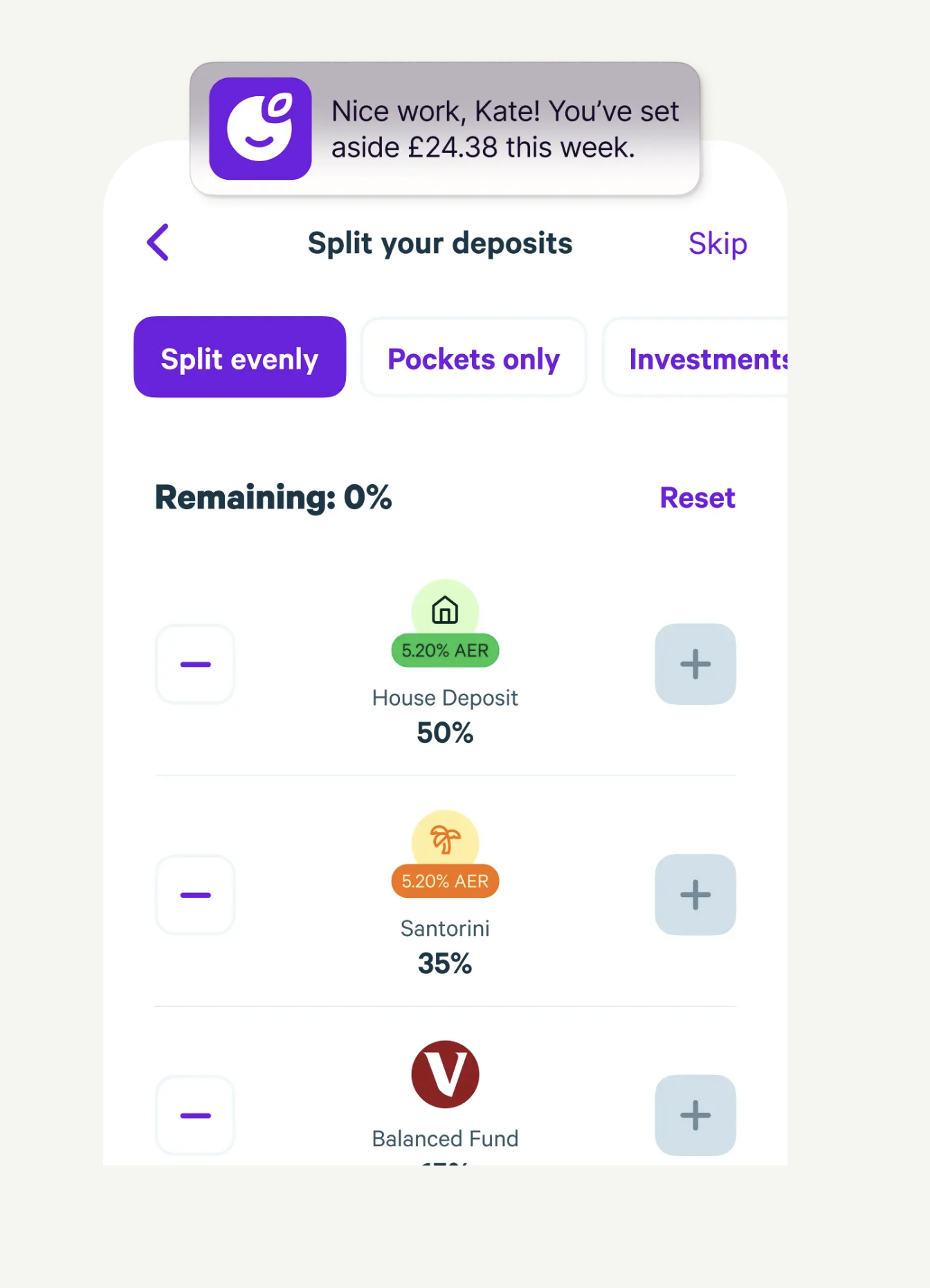
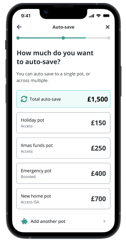
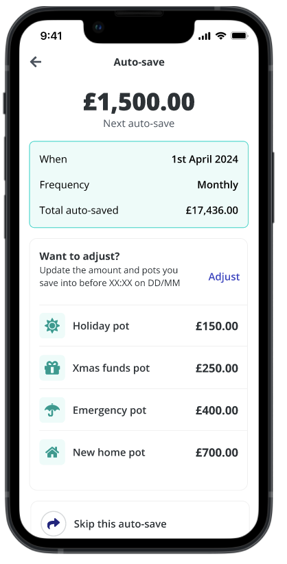
Customers preferred a default single rule for simplicity but expected the ability to override per pot. This led to a hybrid MVP: one global rule, with optional customisation.
Visualising splits reduces load
Participants preferred manually entering numbers over sliders, it gave confidence when locking in decisions. Precision beat speed.
Context matters for entry points
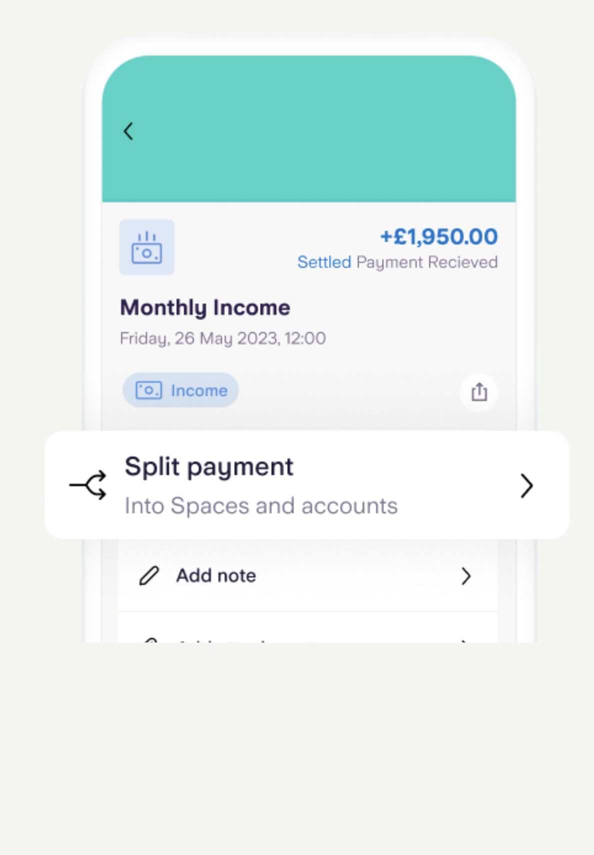
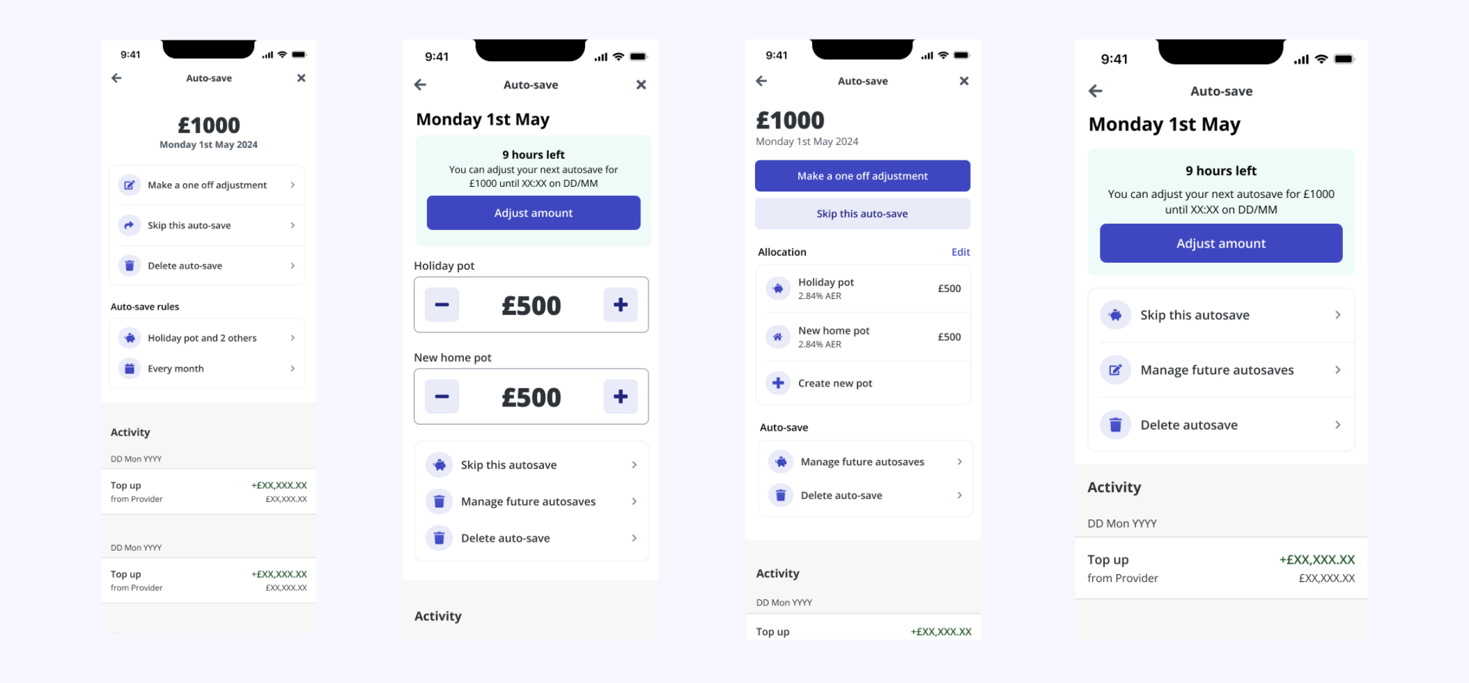
Most users looked for Auto-Save within their existing pots rather than a centralised settings menu. We adjusted MVP access to be inline at pot level.
High-fidelity
After validating hypotheses, I moved into high-fidelity design to refine interaction patterns, visual hierarchy, and information density while maintaining clarity and trust around automation. The key challenge was balancing flexibility and simplicity.
Usability testing
I ran a museum tour with the core team to walk through the high-fidelity thinking. Through dot voting and discussion, we landed on a core experience we were happy to proceed with, but knew we needed additional testing for confidence.
Development handover
I worked closely with engineers and the product team to prepare a structured handover. I created detailed user stories capturing outcomes, design references, edge cases (overdraft conditions, limits), and dependencies between Auto-Save, Pots, and Smart Saver features.
🏆
✦ Outcome
Exceeding every target
The results far surpassed our initial goals, delivering meaningful value for both customers and the business.
42%
Adoption rate
Of eligible customers
82%
Retention rate
Continued use beyond setup
£4.8m
Monthly inflows
+129% uplift
💭
✦ Retrospective
Reflections
What went well
Customer-centric decisions: Grounding every decision in research and usability testing let us confidently balance simplicity with flexibility, giving customers control while keeping things lightweight.
Cross-functional collaboration: Close alignment with engineering, product, and compliance early on helped us move faster and avoid late-stage surprises. Joint workshops and clear communication reduced rework.
Exceeding impact targets: We set ambitious goals around adoption, savings amounts, and inflows, the actual results far surpassed them across the board.
What I'd do differently
Design system constraints: Zopa's existing design system wasn't built for complex multi-step financial flows. We had to extend components carefully, introducing allocation controls and summary patterns, while collaborating with the design system team for consistency and scalability.