A self-initiated side project exploring how human-centred design could support vulnerable users during the pandemic through real interviews
Homely
Scroll to explore


I took the pandemic as the primary influence in my design thinking process as the research conducted is human centred and focused around the needs of users at that point in time. The following case study outlines the UX research carried out, defining the problem, ideation, validating and testing the prototypes with my target users.
Isolating, shielded and the vulnerable users struggle throughout the pandemic. Required to stay in out of risk to their health and those around them, it is difficult to fulfil basic needs of grocery shopping and retrieval of medication.
Other than knowing that our most vulnerable users need assistance, I needed to identify their needs and empathise with what problems they're currently experiencing. There were so many questions that I had, I started to focus in on what it is I knew today and what might delivery the most value for the end user. I came up with the following research goals which would frame my research questions.
Research goals
To ensure the solution addressed real human needs, I conducted a series of user interviews with individuals most affected by the pandemic. My goal was to gain a deeper understanding of their lived experiences, challenges, and coping strategies. By exploring their daily struggles, sources of support, and unmet needs, I aimed to uncover meaningful insights that could inform the design of a product that not only eases practical difficulties but also provides reassurance and empowerment in uncertain times.The following questions were designed to open up conversation, encourage reflection, and highlight the gaps where design could truly make a difference.
Not being able to see loved ones has been hard. Not because I found it difficult, but not being there for those who really need the support.
Getting a delivery slot has been one of the hardest things over the last 7 months. I've increased my takeouts with deliveroo which has been pricey.
I'm also having callings with my pharmascist which I didn't think would ever happen. I've spoken to them more than my own GP.
I've had neighbours check in on me and offer to get me things which has been a huge help. It's been so nice to speak and see them.

.png)
Support
The insights made it clear that while many users had received some form of support, or expressed a desire for it, they were often unsure of what that support should look like or how to access it. The pandemic, though it physically separated us, also sparked a sense of community: people stepped in to help with essentials like groceries or simply offered the comfort of conversation. For vulnerable and shielding individuals especially, this need for social connection proved to be just as critical as practical assistance.
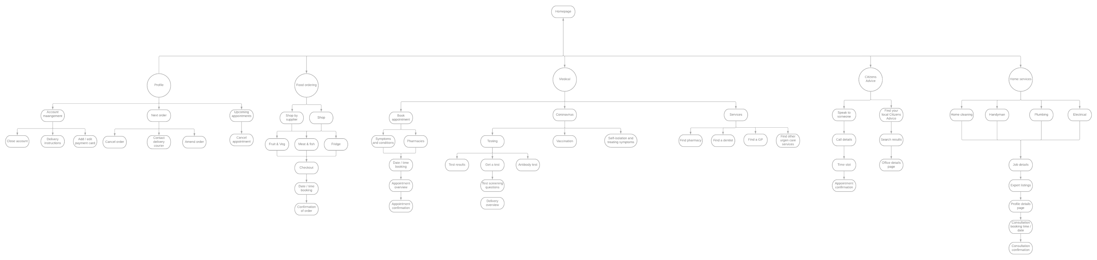
Services
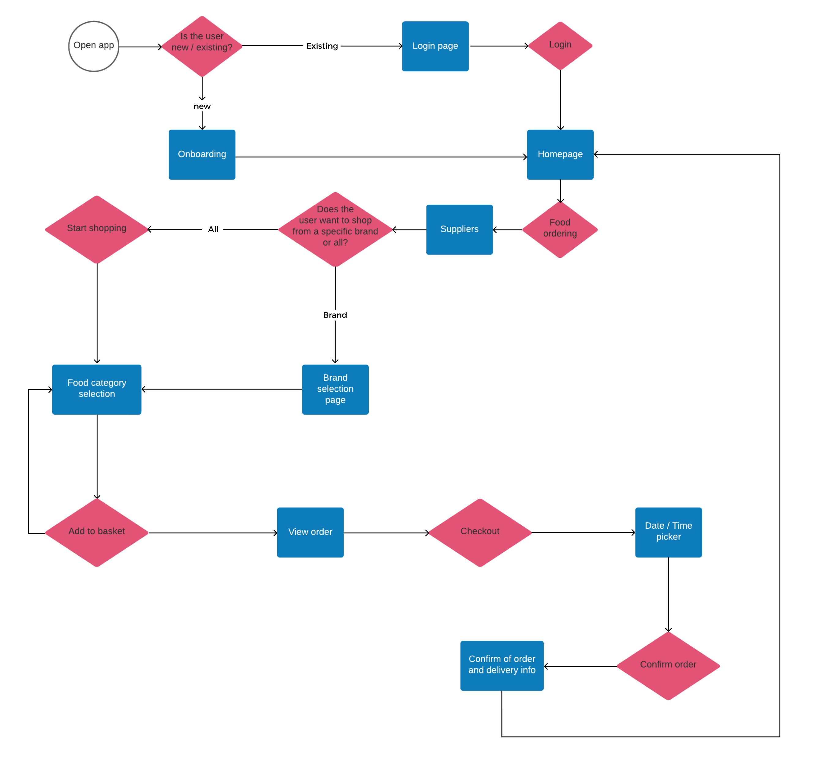
During the pandemic, supermarkets and grocery stores faced significant strain as delivery slots became scarce, often due to stockpiling that surged after government announcements. While efforts were made to reassure customers to buy only what they needed, and supply gradually stabilised, many retailers reduced their services or even switched off their apps altogether. This created further challenges for vulnerable users, many of whom were not formally recognised as priority customers, leaving them uncertain and lacking confidence in securing essential groceries.Beyond food shopping, users also expressed difficulties in completing household tasks, whether due to lack of certainty, resources, or personal capability, further compounding the pressures of lockdown life.
Hardship
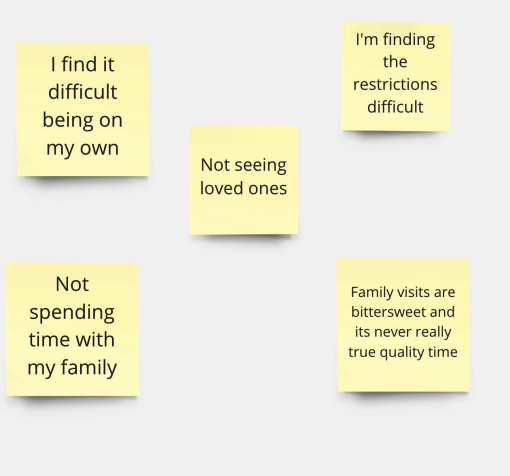
Across the interviews, participants consistently expressed the challenges they and their families faced during the pandemic. Loneliness and the absence of regular social contact emerged as the most significant themes. For those living alone in particular, limited activities made it harder to stay engaged, leaving space for doubt, negative thoughts, and ongoing worry.
Family worries
With ongoing restrictions preventing people from seeing their loved ones, many users expressed deep concern for their families. Questions such asAre they okay? Are they getting what they need? Are they eating properly? Do they need help? Are others acting responsibly around them? were recurring worries voiced throughout the interviews.
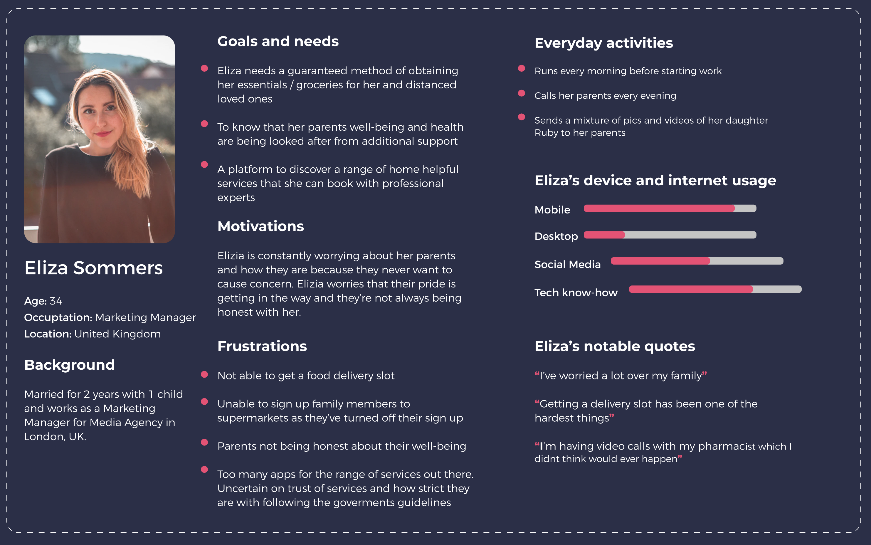
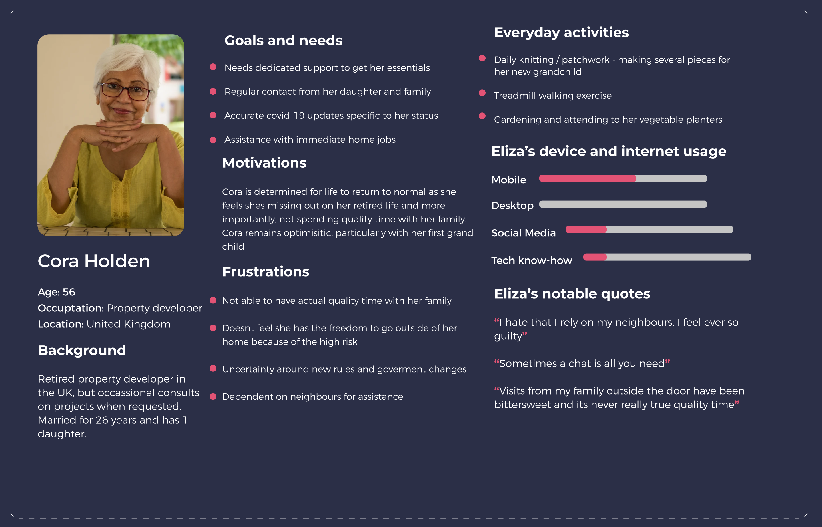
Based on the insights retrieved from the interviews, I was able to translate the research into personas which highlights our users motivations, behaviour and challenges.
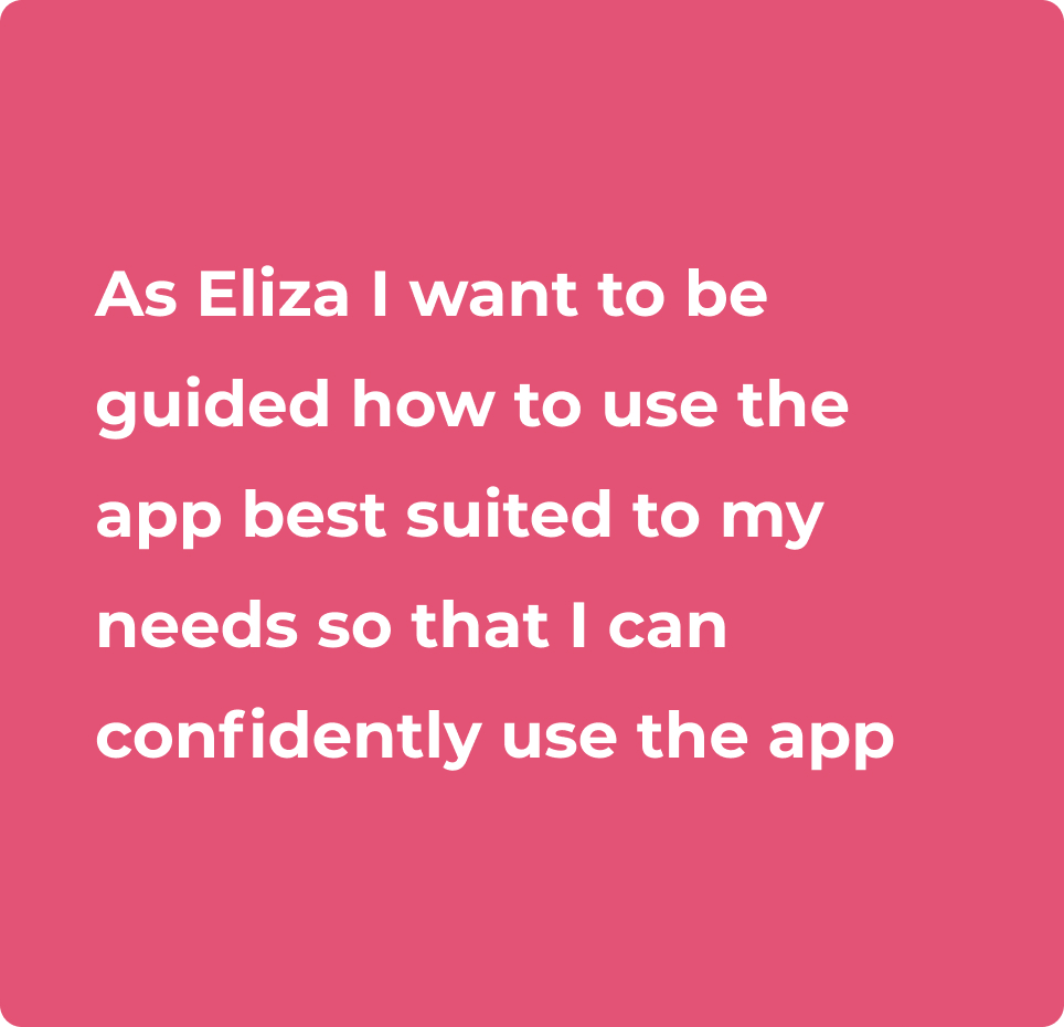
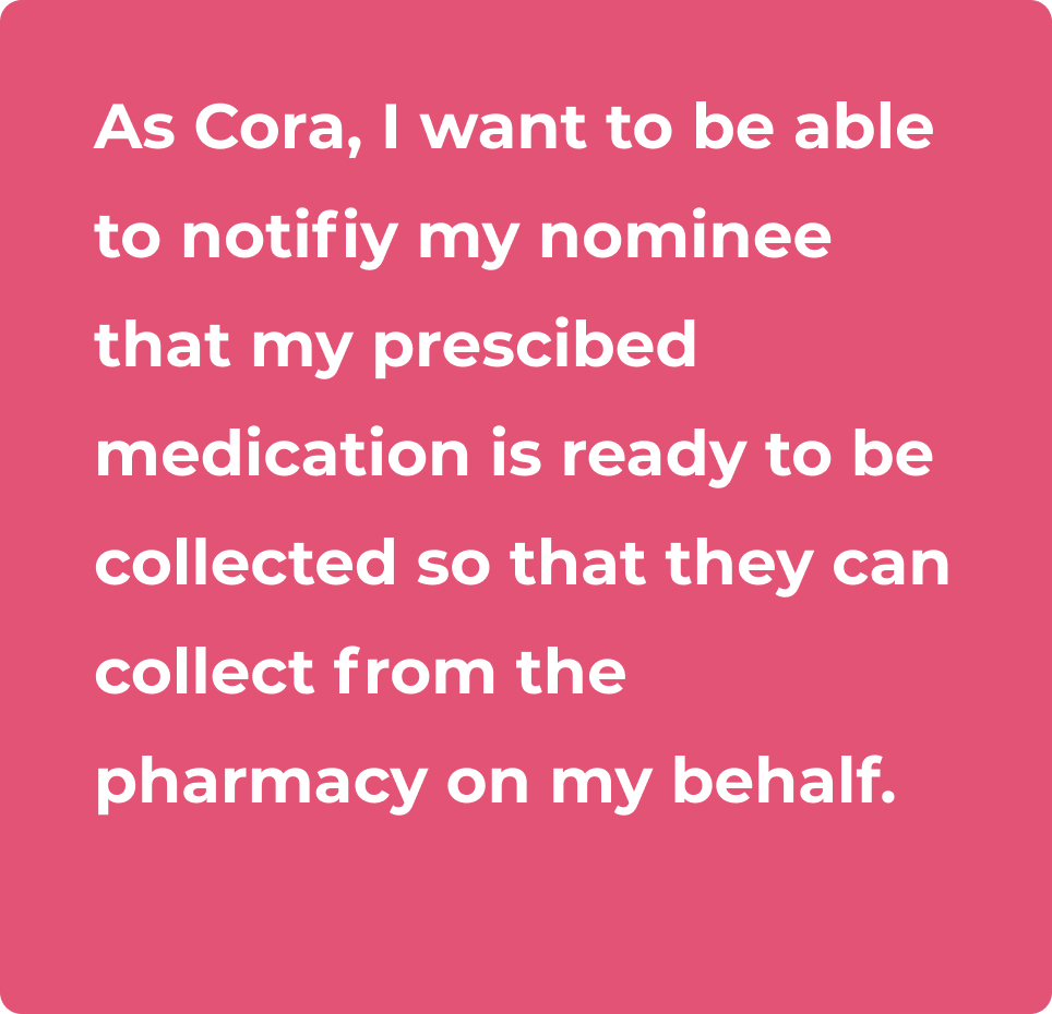
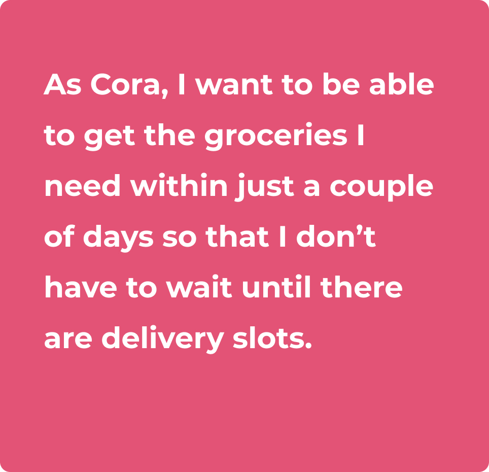
Synthesising both responses and observations obtained from the interviews, I translated the problems into actionable user stories which would enable me to start considering the design based on individual actions the user can take. There are several user stories generated, but I have taken the following 4 as my primary focus for an MVP.
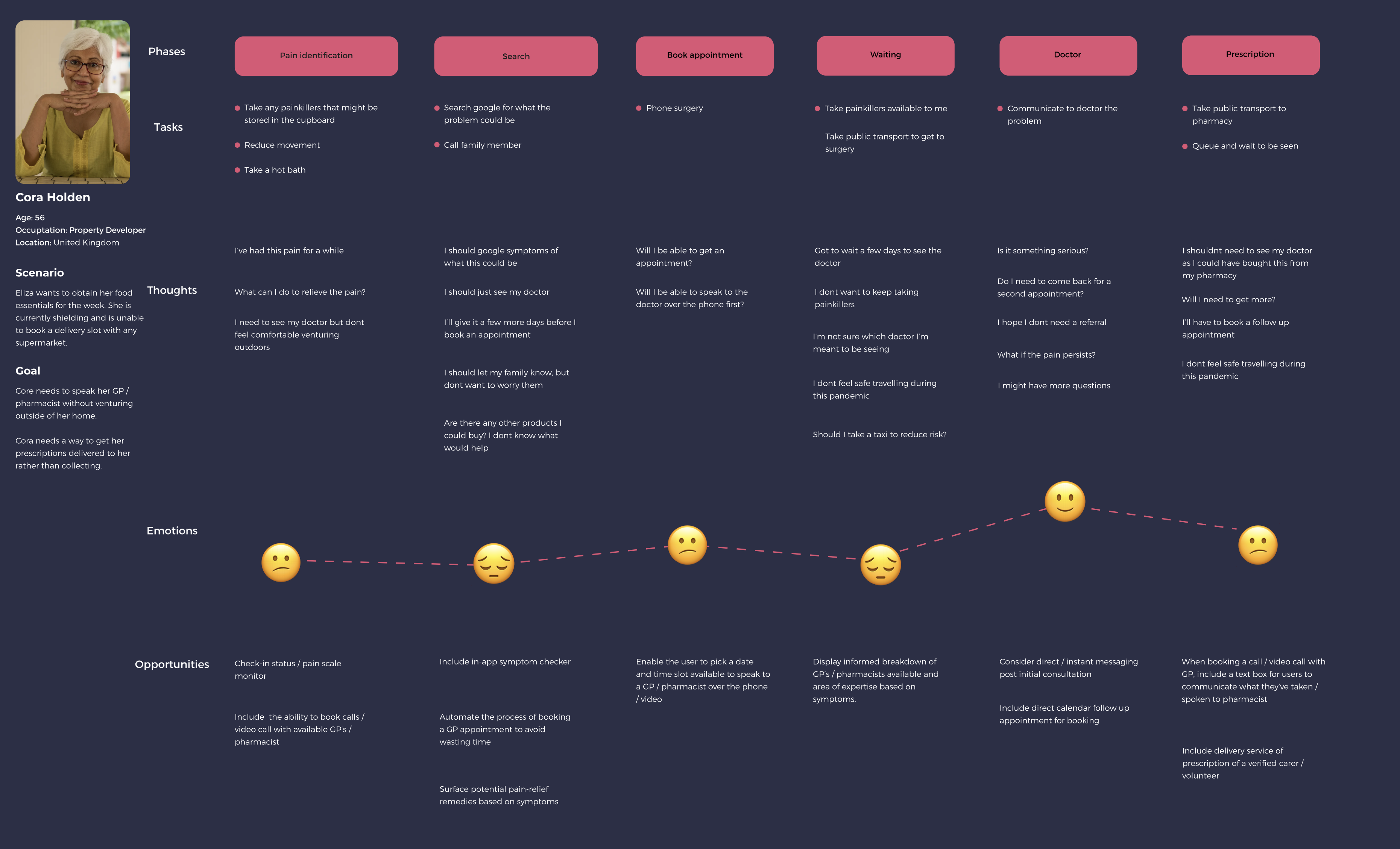
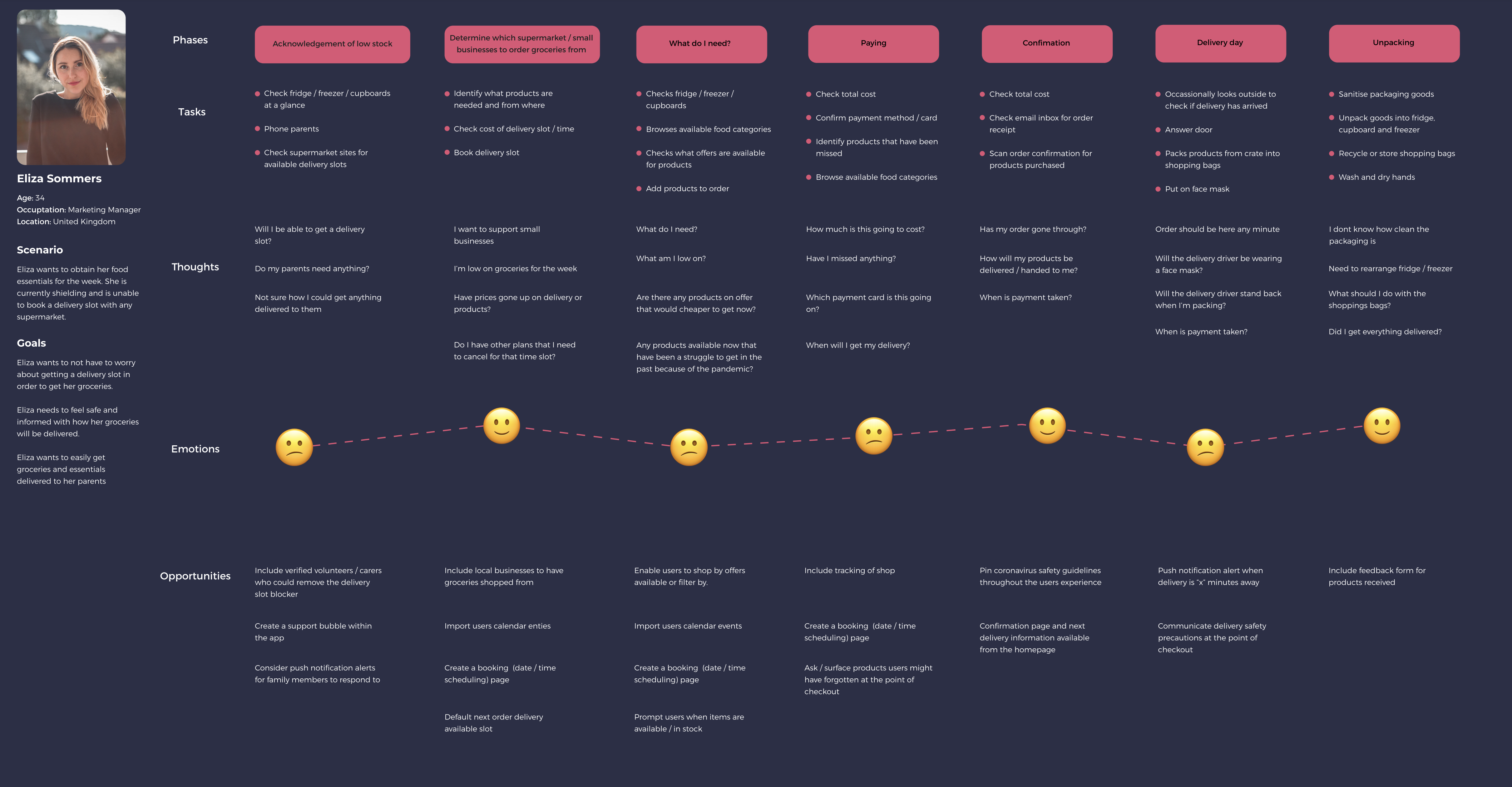
To translate the user stories into more tangible experiences, I created detailed journey maps for my key personas. These maps visualise how Eliza and Cora navigate their daily challenges, from securing groceries to accessing medical support, while highlighting their thoughts, emotions, and pain points along the way. By breaking their experiences into phases, I was able to uncover critical moments of friction, as well as opportunities where design could have the greatest impact.
Placing the needs of the user first, I started translating my user stories into tasks and flows to determine which tasks are required to complete the users goal. In order to the create the task analysis, I set the following questions as my guiding criteria;
User story #1As Eliza, I want to shop and get delivered groceries that I need from local food markets so that I can support small local businesses that are suffering during this pandemic.
User story #2As Cora, I want to be able to book a call or video call appointment with a GP or pharmacist so that I can avoid travelling and remain shielded during this pandemic.
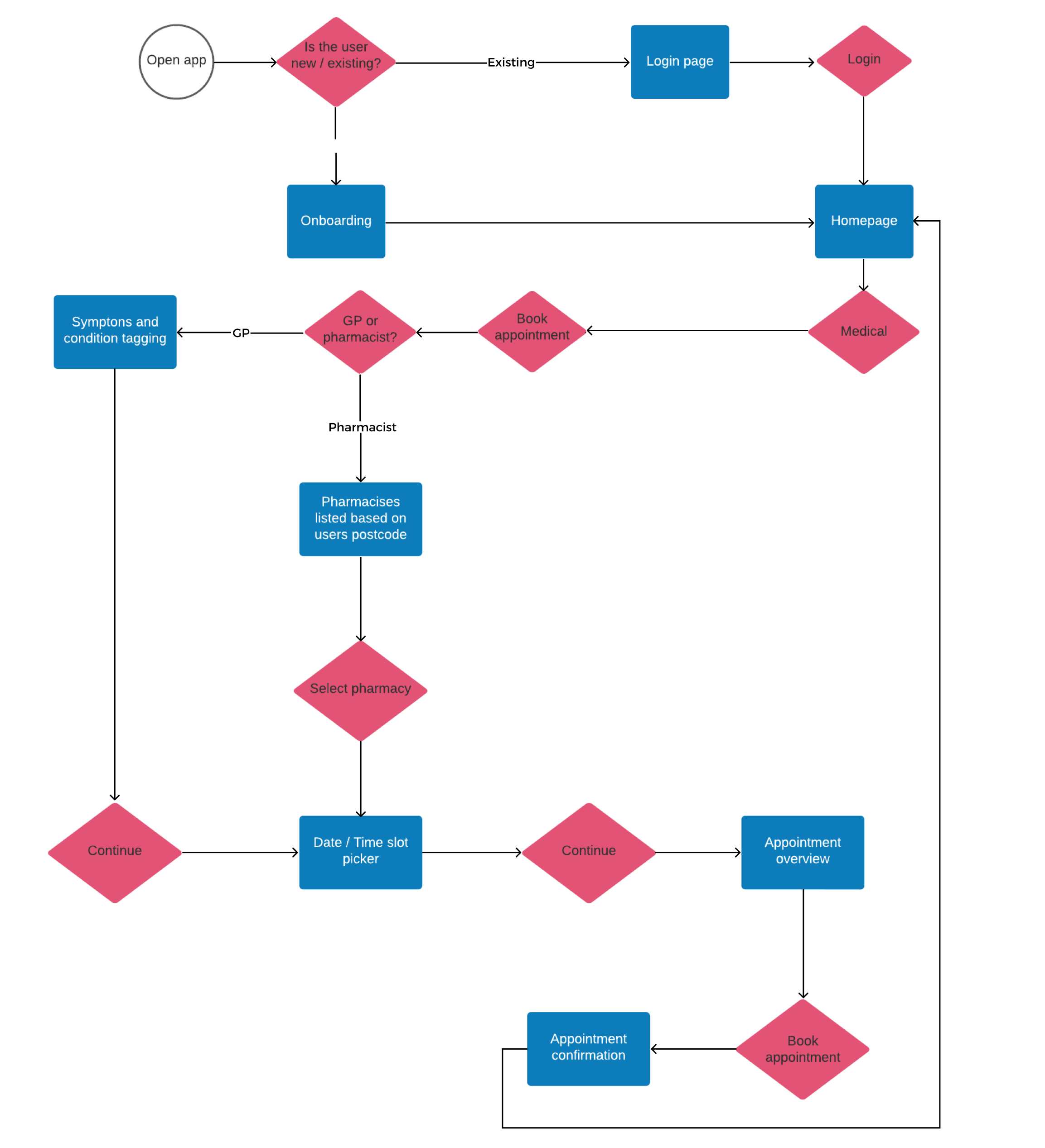
User story #3As Cora, I want to be able to speak to someone to get legal and accurate advice on the Coronavirus and the implications it has on me so tat I am informed and know what I’m entitled to.
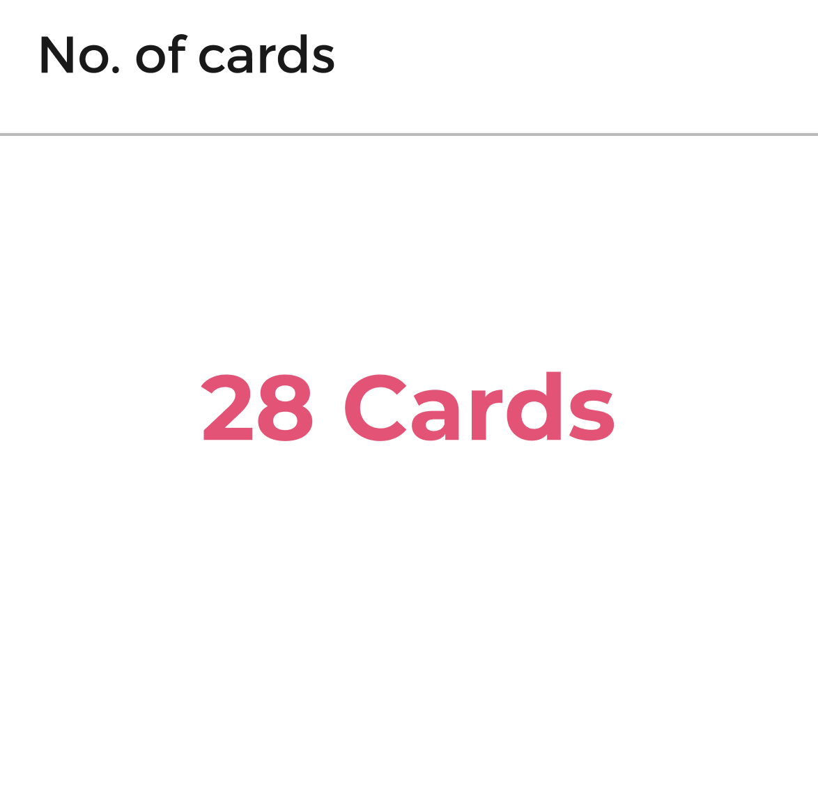
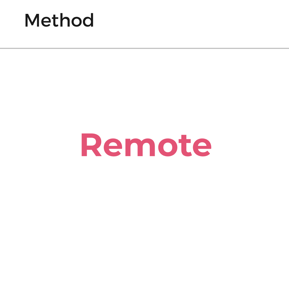
To ensure the IA I've defined is correct, I executed an open card sort to evaluate my assumptions. Given the current pandemic, I used OptimalSort by Optimal Workshop to conduct this remotely.
To ensure the IA I've defined is correct, I executed an open card sort to evaluate my assumptions. Given the current pandemic, I used OptimalSort by Optimal Workshop to conduct this remotely.

The full-screen player (FSP) was designed before the mini-player and directly influenced the final variant we launched on the app stores. It provided an opportunity to showcase the host and their content more prominently, with the show artwork subtly integrated into the background to create a sense of immersion without distraction.The biggest challenge was defining the hierarchy of information. We prioritised the episode title as the primary header, reflecting the user’s immediate context they’re listening to a specific episode, not browsing the show catalog.A secondary consideration was the “Now Playing” metadata, which highlights the current track within an episode. Unlike other streaming platforms, we didn’t want this detail to dominate the interface, so we reduced its prominence while ensuring it remained accessible and easy to find for users who value it.
Based on the research, the sitemap has been adapted to reflect user feedback, with the most significant changes occurring within the medical category. We explored grouping related areas such as vaccinations, self-isolation, and symptom management, as well as combining symptoms and conditions. The original idea was to guide users through progressively stating their reason for booking a GP appointment. However, participants highlighted the importance of explicitly including Coronavirus-related needs within this flow. This requires careful consideration of how the interaction should work and further validation with users, since the context differs from general medical needs.Additionally, participants recommended refining category labels to make navigation clearer. For example, upcoming appointments was renamed to my appointments and next order to manage orders. Some groupings and small additions were made to improve clarity which points to our next setp of testing an MVP to determine whether these adjustments met user expectations or risked comprimising their ability to complete key tasks.
Hand-holdNot all of our users are going to be confident in using the app as they have little to no familiarity with apps in general. To ensure the experience is as comfortable as possible, each utility / service provided needs to personally guide and communicate with the end user as much as possible. The nature of the app and our user stories is prescriptive and specific to a need which they've not been able to solve without yet.
Action over content
Step away from copy and be descriptive. Get the user taking action - they're here to solve a problem. Let's get away from explaining and take the opportunity to make our call to actions, titles, and primary actions do the work. Dont get in the way.
Be as familiar as possibleOur app has a lot to offer, but not everything is brand new. We're not re-inventing the wheel. Consider those apps which our users are using right now - from groceries, to medical and to contractors. Consider the competition and improve where neccessary.
Knowledge is power
Users are uncertain, worried and scared. Keep it simple by ensuring users are always informed and decisions are validated. How does the design choices made remain true to this. How can we ensure are users always know what's going in at that precise moment.
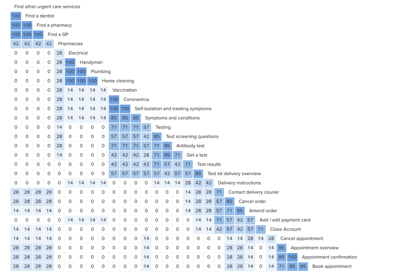
I started crafting low-fidelity sketches which aims to highlight only the high-level functionality of the design - purposely glossing over the details of the design and takes only the design requirements, objectives and user stories as influence.
Using Balsamiq, I iterated various home versions of the app. Considering the design requirements set out and the user personas, the home tab provides an opportunity as an entry point to the various services available within the app from the immediate. Whilst the primary navigation was considered, I kept this free from clutter and define this as the users personal area.
.png)
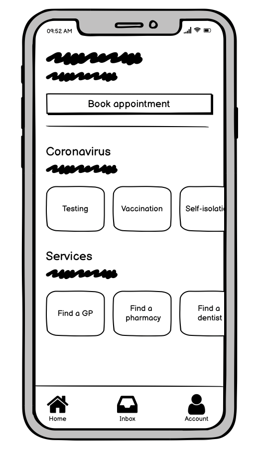
The medical category remains true to the strict-hierarchy as defined in the IA as it provides a direct link to it's subpages through correct paths only. There's no getting around from one category to another once in it.
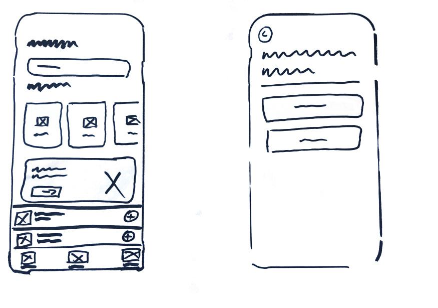
Whilst my low-fidelity designs are able to communicate the basic user flow and user experience, I started to transition my designs to high-fidelity which aim to include detail and reflection of what the real UI components may potentially look like and start accurately communicating functional behaviour to both developers and stakeholders. Each stage is consistent with minor adjustments when necessary only with no drastic changes / surprises from stage to stage. This continues to consider my user personas as we want to encourage a high and quick adoption rate.
Onboarding
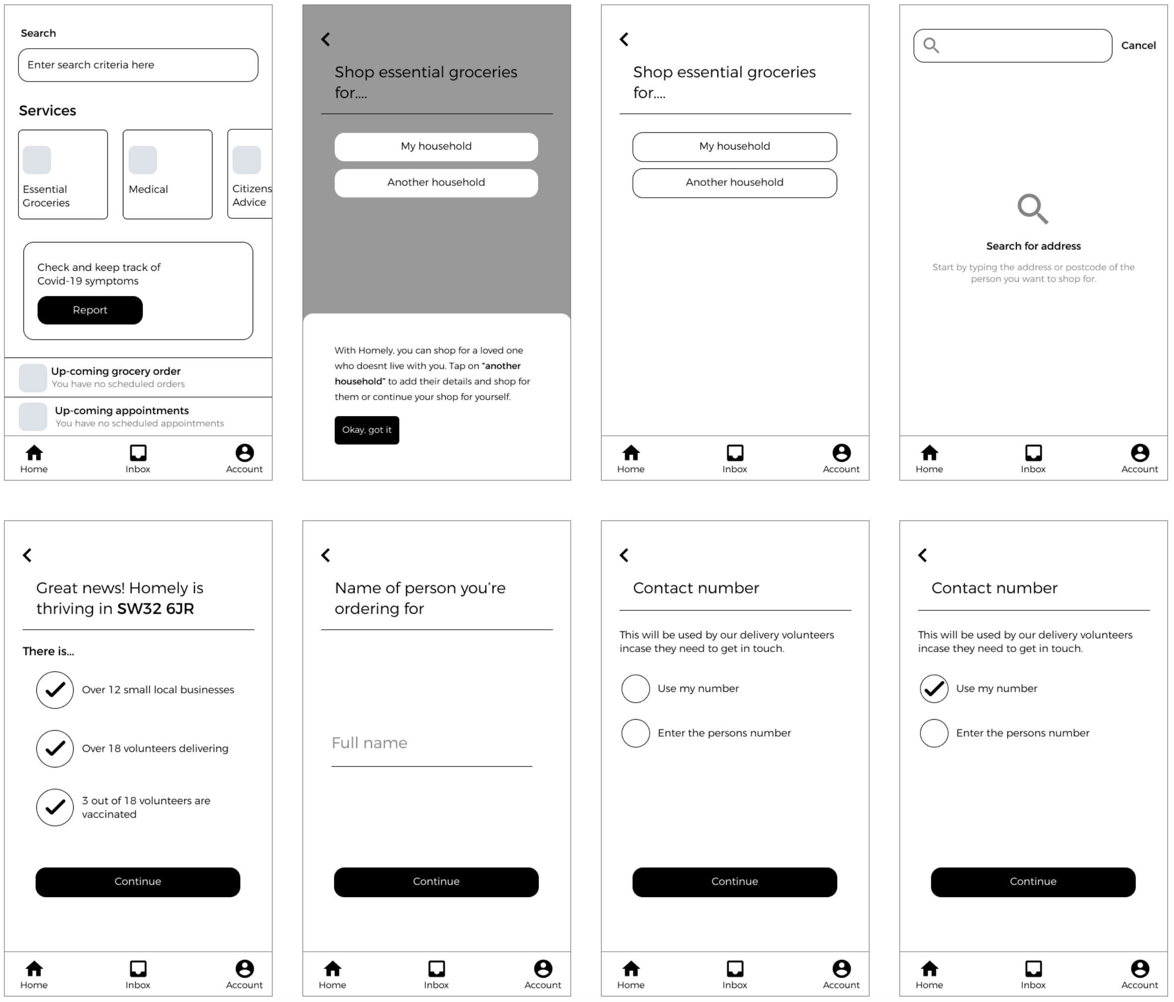
Apps can often feel intimidating, and for some of our personas, this app might even be their very first digital product experience. Without the right guidance, onboarding can quickly become stressful and discouraging, leaving users to figure things out on their own.With this in mind, I treated onboarding as more than just a one-time introduction. While I included a swipe-based tutorial to highlight the app’s key value propositions, I wanted to avoid a “set it and forget it” approach where users are left unsupported after the initial walkthrough.To address this, I complemented the onboarding flow with contextual coach-marks. These provide guidance at the right moments, pointing out essential features as users encounter them for the first time. For example, when a user places their first grocery order, the app highlights how to navigate the service; when hiring an expert, prompts appear to explain how experts are filtered and matched to their needs. This progressive, just-in-time guidance ensures users feel confident and supported throughout their journey.

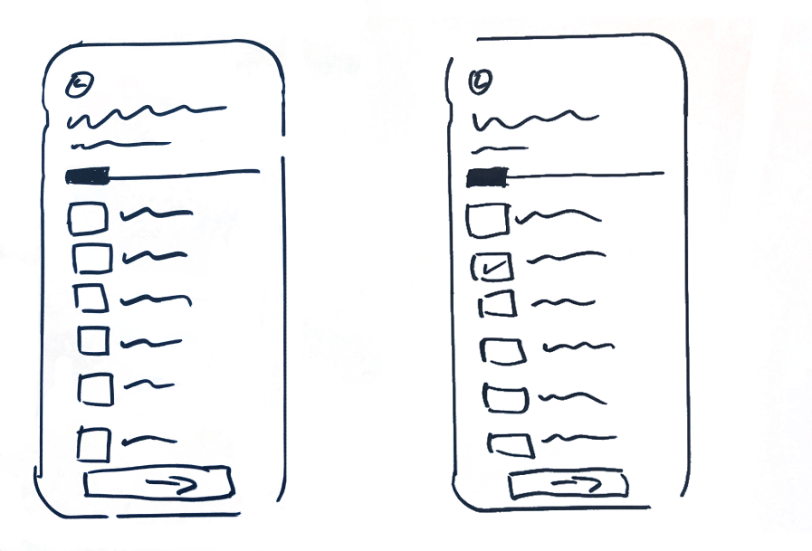
Prompting through first interaction
As introduced in the onboarding flow, the example below demonstrates how coach-marks are integrated into the user’s first interaction, guiding them through the process of adding a nominated user to support their grocery shopping experience.
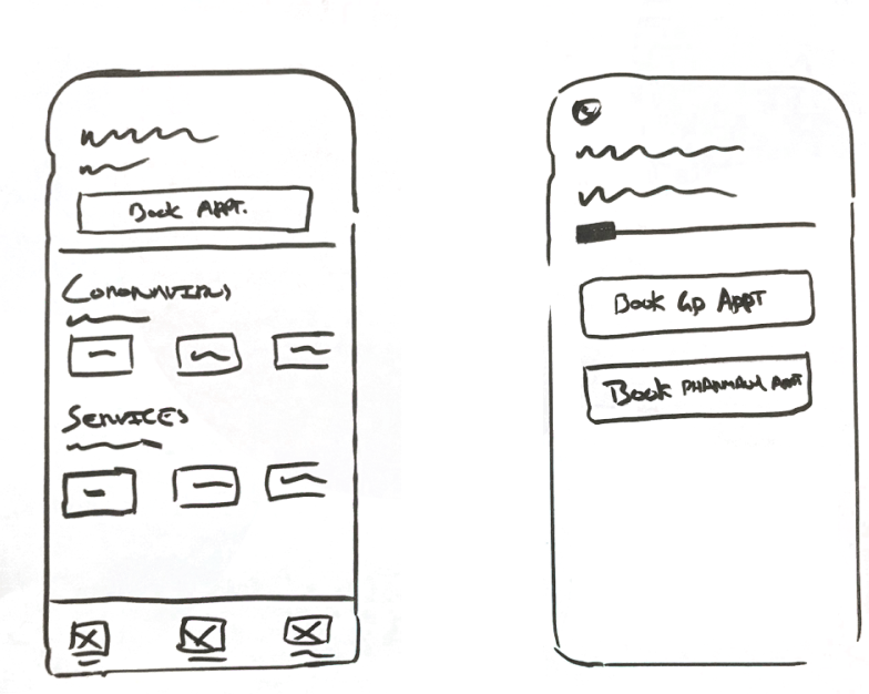
A progressive experience which enables the user to get moving quickly and completing their primary goal of booking a contractor. This experience shares patterns used across the various services available, permitting a consistent experience and avoiding cognitive dissonance.
Reporting symptons
Utilising familiar patterns as seen within the booking a contractor experience, this simple and straightforward feature continues the fight against the coronavirus as users can report their symptoms for either themselves or their child.
This project gave me the opportunity to explore a problem space shaped by the pandemic and design a solution that could genuinely support vulnerable users in meeting their everyday needs. Through user interviews and card sorting, I was able to uncover real pain points and translate them into insights that informed the app’s information architecture, user flows, and design decisions. Moving from low-fidelity sketches to high-fidelity prototypes allowed me to test how the concept could look and feel in practice, while exploring approaches to onboarding, navigation, and accessibility. Although the project did not progress to user testing of the prototype, it provided valuable learning in applying human-centred design methods end to end, balancing research, ideation, and execution within the constraints of a passion project. Ultimately, this case study reflects my ability to take an idea from problem definition through to a designed prototype, grounding each step in user needs and maintaining focus on clarity, empathy, and usability. It’s a foundation I could confidently build upon in future iterations, whether through further testing, scaling the concept, or applying the learnings to new design challenges.