A focused design sprint to transform Zopa's cluttered savings dashboard into a flexible, personalised experience that serves both customers and business goals.
Zopa's main savings dashboard lacked the flexibility to meet both customer and business needs. For customers with multiple pots, the dashboard felt cluttered and hard to manage, limiting our ability to influence customer behaviour and promote new offerings.
We needed a more organised, adaptable dashboard that enhanced the user experience and supported business growth. The sprint was our opportunity to step back, align the team, and design a fundamentally better experience.
This wasn't about a reskin. The team was clear: we wanted a new tangible vision for the dashboard, something flexible for both us and customers, that conceptualises new experiences and hints at future product directions.
^ the brief was ambitious for 5 days 🔥The old dashboard
Before diving into design, I mapped out the dual needs of the dashboard, what customers want and what the business needs, to ensure we were designing for both audiences simultaneously.
Customers want to see their total balance, pot breakdown, and progress at a glance without navigating through multiple screens.
Add money, withdraw, and open pot need to be prominent and accessible within one or two taps from the main screen.
As customers grow their savings, the dashboard needs to scale gracefully, not feel more cluttered with each new pot.
The business needs space to promote new savings products, cross-sell opportunities, and surface timely information like ISA allowances.
Drive actions like setting up auto-save, boosting pots, and adopting multiple products through contextual, personalised prompts.
Tailor the dashboard to different customer lifecycle stages, from first-time savers to power users with multiple pot types.
I facilitated a structured stakeholder workshop with product, engineering, and leadership to surface wants, needs, hopes, and fears for the sprint. The agenda was designed to get the team out of their heads, aligned on direction, and inspired by what's possible.
Each team member shared what they wanted and didn't want from the sprint, surfacing alignment and tension points early before a single pixel was designed. The board ran across four quadrants: what we want to see, what we don't want, post-sprint hopes, and post-sprint fears.
We defined six core customer jobs and used blind voting to prioritise them against business outcomes. The top-scoring jobs became our design anchors for the sprint.
Score: 17, the highest-rated job. Customers need a streamlined, decluttered interface for managing growing numbers of pots.
Score: 15, actionable, personalised content that helps customers make smarter financial decisions.
Score: 14, seamlessly integrate new product discovery into the experience without overwhelming the user.
Each job was scored (1–5) against four outcomes: increase engagement, encourage product adoption, enhance satisfaction, and improve retention. This gave us a data-driven prioritisation framework that the entire team bought into.

To navigate our thinking, we applied principles from Zopa's Grow framework, giving us a clear lens for every design decision:
Customers are empowered to create an experience that suits them. Zopa can deliver specific recommended actions to drive value and interaction.
Customers can easily complete their priority tasks, whatever their product. Zopa can surface information that empowers customers to make good decisions.
Customers can easily discover information about their finances that they wouldn't otherwise see. Zopa can recommend products based on their unique situation.
With priorities aligned, I ran a collaborative sketching exercise where team members drew their vision for the new dashboard. This wasn't about polished output, it was about surfacing mental models and generating diverse ideas before converging on a direction.
Alongside sketching, we ran a UI inspiration exercise where the team reacted to patterns from other apps (Opal, financial dashboards, widget-based UIs), identifying what felt right and what felt wrong for Zopa's context.

From the workshop outputs, I synthesised the team's input into a clear dashboard architecture built around four distinct zones, each with a specific purpose and set of customer jobs it serves:
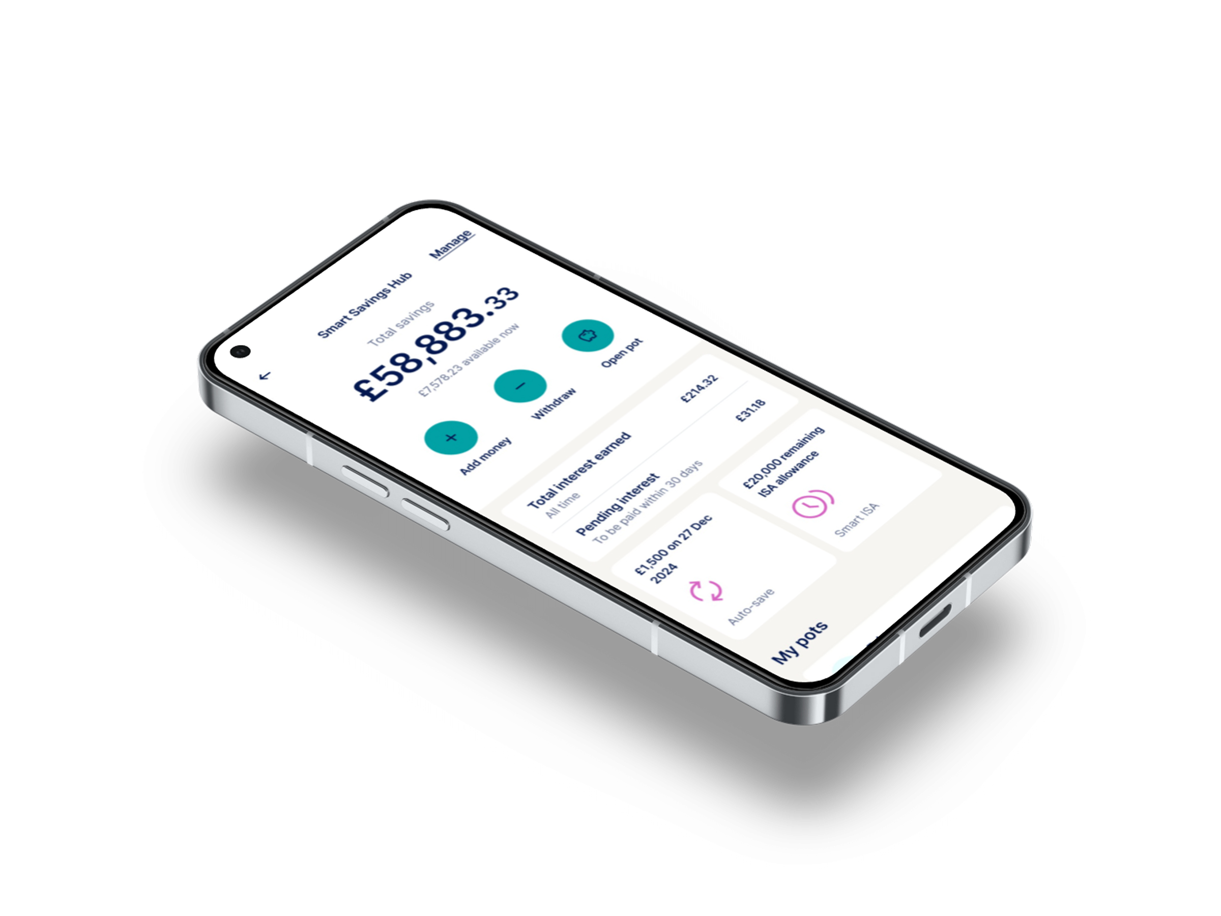
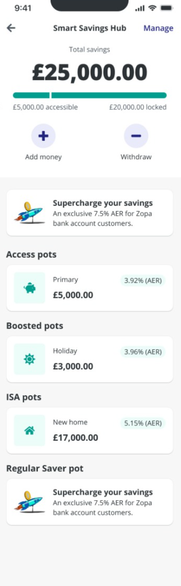
The account hero, total balance, accessible vs. locked funds, and key action buttons (add money, withdraw, open pot). The immediate financial snapshot.
Interest earned, suggested actions, and promotional widgets. A personalised zone that surfaces relevant nudges based on customer lifecycle stage.
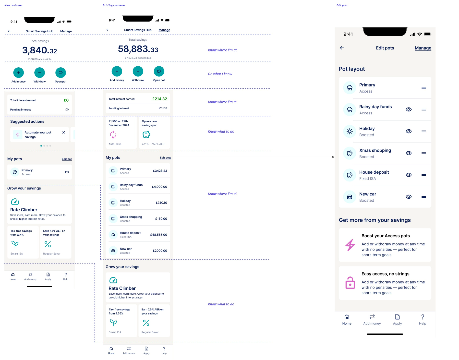
A compact, customisable list of all pots with pot type embedded. Edit pot order, hide pots, and manage savings in a streamlined, scannable format.
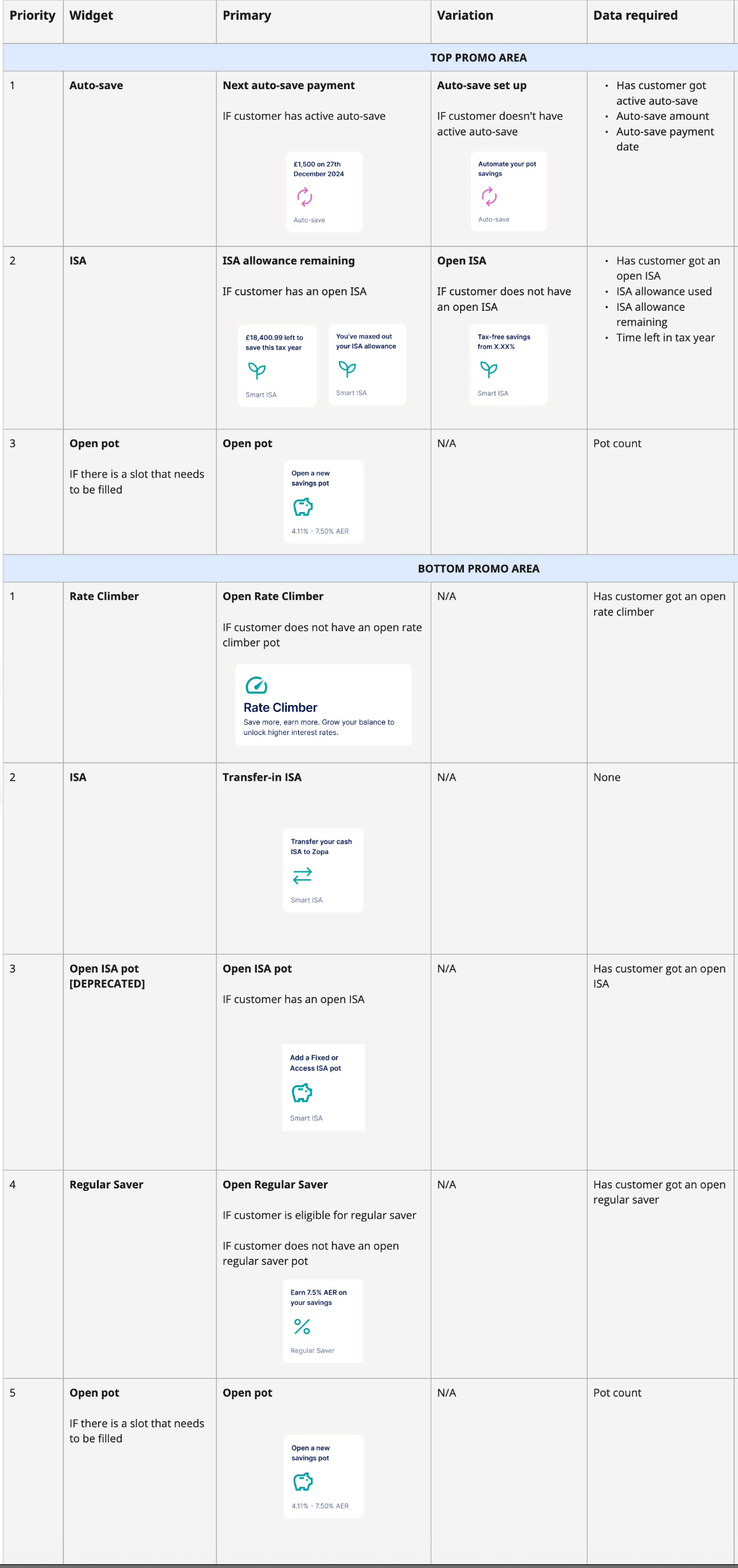
Crucially, this architecture introduced a widget-based system, modular components that could be added, removed, or reordered based on customer context. New widgets for ISA allowances, auto-save prompts, and Rate Climber could be surfaced without redesigning the dashboard.
Total balance, accessible vs. locked funds, and quick-access action buttons, always at the top.
Interest earned highlights the value of saving. Suggested actions guide customers toward positive habits based on lifecycle stage.
A compact, customisable pot list with type embedded in each card. Drag to reorder, hide pots, designed to scale to 20+ pots.
Lifecycle-segmented recommendations that surface the right product at the right time, Rate Climber, Regular Saver, Smart ISA.
↑ Hover over each zone in the wireframe to highlight the corresponding section detail
I explored multiple design directions during the sprint, iterating rapidly with two stakeholder reviews built into the schedule. Each review sharpened the direction and built team consensus.
We ran unmoderated remote testing with 8–10 active savings pot customers, a mix of beginners and experienced users. The test focused on whether users could understand the dashboard layout, identify their pots, and interpret the "Edit Pot Order" functionality.
Described as "easy, simple, clean, understandable, minimalistic, and very well designed." Strong positive first impressions across all participants.
Not all participants immediately recognised the drag handle icon, but most understood the concept. Some participants wanted to see all pots at dashboard level.
Participants weren't sure what the eye icon meant in the edit pot page, though they understood the primary pot couldn't be hidden. An area for refinement.
The final output wasn't just a set of screens, it was a modular widget system with clear prioritisation logic. Each widget had defined conditions for when it should appear, what data it required, and how it related to Jira tickets for development.
I documented every widget component, from the account hero and interest earned section to promotional areas, pot cards, and the "Grow your savings" recommendations, each with their primary and variant states, data dependencies, and implementation notes.
↕ Scroll to explore the full widget system
The sprint proved that a well-facilitated 5 days can deliver more aligned, confident output than weeks of async iteration. The key was getting everyone in the room, grounding decisions in real customer jobs, and designing a system, not just screens.
^ systems thinking > screen design ✨